February 12, 2010

Possible Hard Landing for Australia in 2010

Strong Head Winds for Australia in 2010

We are now in February 2010, and I am observing the unfolding of a dual situation which I think has a chance of being mutually detrimental to both countries in 2010. There is no getting away from the fact that Australia has an incipient property bubble, with a recent world wide housing survey showing that Australia has the most unaffordable housing in the world. Click the link for the DHI PDF of the survey.
For a more in depth look at how the Australian bubble developed and went on steroids since 2009 check out Steve Keens blog-post on Its Debt, Debt Debt for Australia. In this post Steve Keen talks at length on how Australians household debt levels surpassed the United States, and how the misguided policy actions of the Australian Government in reaction to the Global Financial Crisis has set Australia up for a hard landing, probably not in the too distant future. Keen writes,

"We actually began to reduce our debt levels before America—with household debt falling from 99% to 96% of GDP in March 2009. but then the federal government’s First Home Owners’ Boost began to kick in (it was introduced in October 2008, and I railed against it at the time—see “Rescuing the Economy or the Bubble?”). This enticed new entrants into mortgage debt in record numbers: during the life of the Boost, over 1 percent of the Australian population took the government’s additional $7,000 bribe down to the bank, and levered it up five or more times with a mortgage. Even though households were reducing other forms of debt, total household debt rose until it cracked the mark of 100% of GDP in the last month."

I believe based on the evidence, and having now seen and observed in real time what a housing bubble looks like, and what it smells like in the form of the US housing bubble, the Irish housing bubble and the UK property bubble, that Australian housing prices will be heading south in the not too distant future. This will have a detrimental effect on the Australian Dollar, which I believe will correct significantly against the USD.

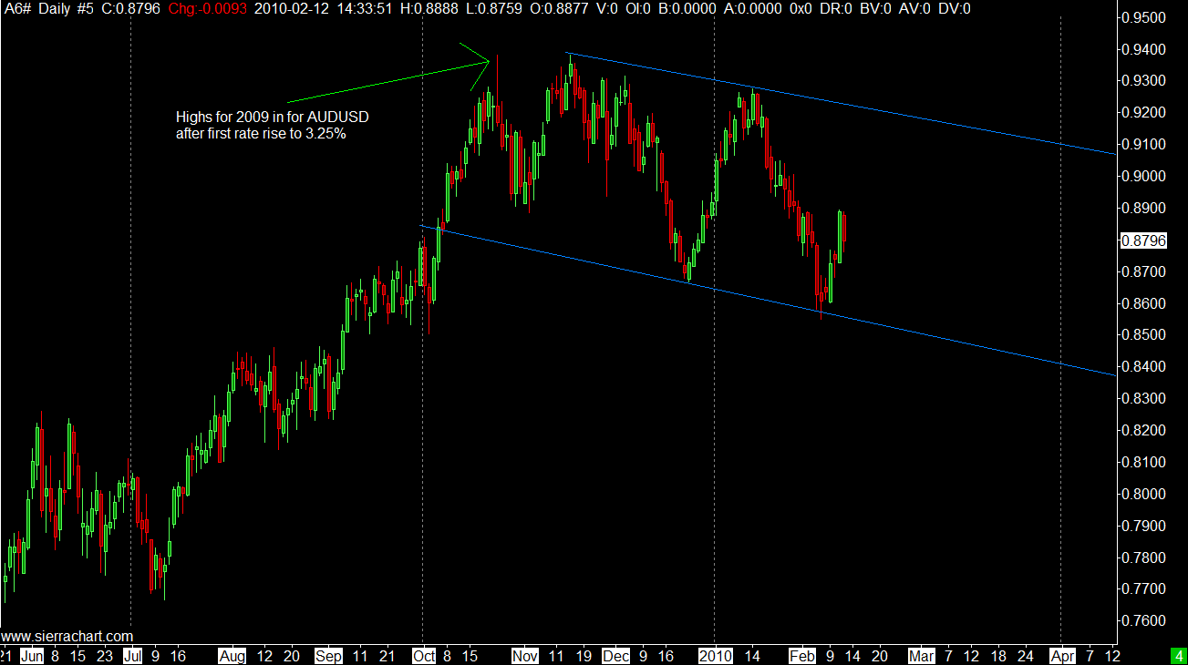
There are a number of factors I see weighing on the AUD over the next few months. Below you can see the RBA decisions starting in October 09 to start increasing rates, due to fears of inflation, and possibly this was some kind of recognition that houses prices had risen too far. At the time the initial rise took the markets by surprise, and of course it added to the carry differential which has been positive for the AUD against lower yielding currencies. At the next two meetings the RBA continued with the 25 basis point rises, taking rates to up to 3.75% at the present.


However, on checking the chart below one can see that the first interest rate rise lead to the high for the year for AUD. The rate rises were already baked into the cake after the first rise, as the AUD failed to gain any further ground. In all likely hood the statement from the RBA at the time was so hawkish that the market had baked into the cake the further 2 rate rises during the initial rise. At the time I remember thinking that they have set out from the traps far too early with these rises, and when the real estate bubble pops they will quickly reverse these. At the time I was thinking possibly March 2010, but that now seems a little premature, although with general sentiment turning quite negative at the start of 2010, and the tangible fear of some kind of sovereign default perhaps a turning point is not too far away. At the last meeting the RBA decided to take a breath and pause with the rate increases for the time being, even though the market was pricing in an increase.


  GoodsServicesTotal% shareRank

China


57,922

5,831

63,753

13.2

1

Japan


54,617

4,965

59,582

12.3

2

United States

34,930

14,742

49,672

10.3

3

Singapore


19,025

9,017

28,042

5.8

4

United Kingdom

16,808

8,891

25,699

5.3

5

Republic of Korea

20,415

2,416

22,831

4.7

6

New Zealand

16,476

5,976

22,452

4.6

7

Thailand


13,448

2,729

16,177

3.3

8

Germany


12,026

2,235

14,261

2.9

9

Malaysia


11,567

2,497

14,064

2.9

10

February 11, 2010

Model Showing Swings between Risk Tolerance and Risk Aversion

Risk Aversion/Risk Tolerance Visual Model

I have amateurishly enough drawn a model, or a visual aid below which shows how I conceptualise visually, at least, the dance between risk aversion and risk tolerance. This has been the model, and the inter-market relationship over the last decade. It visually demonstrates how US Dollar liquidity effects asset prices. The same model could also be applied to the Japanese Yen.

If we assume that the US Dollar is the nucleus at the center where low interest rates, and increasing US dollar liquidity, leads to a carry trade of sorts where money moves from the center to the periphery. As the periphery moves further away from the center so does the risk and the yield. This bids up assets which lay in these outliers, increasing the yield, and leading to speculative booms. This in effect is what seems to have been at play during most of 2009, and also from the period 2002-2007. This causes the US Dollar to weaken, and other assets to increase in value, hence we had the inverse relationship between stocks and commodities, higher yielding currencies and global real estate markets. However, when these bubbles burst as they inevitably do, the money spirals back to the center, leaving the higher yielding assets, and flowing back to the center, which is essentially US Dollar positive.

One only needs to have watched the events unfold since the start of 2010, with investor sentiment turning sour on Euro zone member countries due to the increasing likely hood that they will not be able to manage their fiscal deficits.

Below the diagram, I have posted a few charts to show this dynamic in action...


This chart shows the US Dollar Index, and its performance during bouts of risk appetite.


The next chart shows, how diminishing risk appetite impacted stocks, using the S+P as a proxy...


For me at least, this simple diagram enables to visually and conceptually understand the global macro dynamics that are at play in the global economy. By the way this is not to say I m long term positive on the USD. I am very bearish on all paper currency vis-a-vis hard assets, such as farmland,industrial commodities, agriculture and precious metals. The US is the reference currency, and rates are being held at incredibly low levels, the FED will continue to print money in the face of any adversity, the US administration will continue to increase spending and the budget deficit, and the unfunded liabilities in the US will eventually undermine the US Dollar. The problem is that other currencies are not much better, such as the Euro, Sterling, the Baltic states and in the long run the Japanese Yen. However all paper money will depreciate against hard assets.

GBPJPY Outlook Uncertain

How Look GBPJPY...10/02/2010

The volatile pair is at a cross roads. The price is resting at its near 12 month support line around the 138-140 mark. See Fig 1. The last month has seen a sharp fall in the currency pair which becomes more volatile as the risk aversion trade takes over. At the moment the world markets seem to be at yet another cross roads in the never ending narrative which is the world financial markets.


The fear due to the sovereign default risk emanating from the Euro zone over the last few weeks has been palpable. There has been a very sharp adjustment in world capital flows as investors who have been previously willing to take on more risk now change their stance to preservation of capital. This has led to money moving from global stocks (see Chart 2 of S+P500), commodities and riskier assets, back to the major liquidity source, the USD and the JPY.

Chart 2 S+P Futures


What does this mean for the GBPJPY?


Last week the pair made a low at 138.28, before rising from this long term support this week. This has been the 4 or 5th test of this area, which inevitably is trying to tell us something. I believe the GBP will break down below this area, possibly in the coming days and weeks. However, I m more inclined to think that the sharp drop in the markets may take a pause, and a rally can occur. This in theory, all things being equal that the GBPJPY should rise, and makes a candidate for a good short term long trade, perhaps 3-7 days.

Negative sentiment seems to have calmed down for the time being, as the markets seems to be taking its cue from the ECB and the other main protagonists in the Euro region, namely Germany and France that Greece will get the necessary help needed to stave of the worry that Euro zone nation will default on its debt. However, that does not mean the jitters have gone away yet. Investors remain on edge and the smallest of catalyst is all that is needed to send markets lower. One such case in point can be highlighted today when some German officials made a statement which did not mention that a bailout was guaranteed, which the markets took as a cue to reverse earlier gains.

However for the time being it seems the market is expecting a bailout for Greece if needed perhaps evidenced by the fact that Greek Bond prices rose strongly, with yields dropping some 55 basis points. This type of rally is indicative that Greece has the backing of the EU officials. I believe this sets the stage for a possibly return to risk tolerance in the short term.

I think it is important to add at least one caveat. When you find one cockroach, it is very seldom you only find one. There are definitely other cockroaches hanging around the Eurozone, in the form of the PIIGS, the unflattering acronym for Portugal, Ireland, Italy, Greece and Spain. The remaining four PIIGS will in my opinion provide a much bigger headache in the not too distant future.

How to Play a possibly short-lived return to taking on more risk?

As already mentioned I think the stage is set for a rally in higher yielding assets. The US Dollar has had a tremendous rally, which I think may be overdone in the short term, but I don't believe the dollar is done just yet.

In these volatile markets where the inter-play between the will to take on more and risk and the tendency to shun risk can turn on a dime, I am of the opinion that you need a dual strategy to play both sides of many different coins. Below in the intraday chart 3, is the GBPJPY, this is a 20 pip range candle chart. As can be seen we into the 5th day of either a base building period. A return in earnest to the risk trade should see the pair move above the 141.40 mark. I think a good risk/reward trade is to play the breakout of this range. On the other as already mentioned above, the markets still remain on edge, and it we need to allow for the risk that another cockroach can appear from nowhere.

The two price levels I think which are pivotal are as follows;

1. For the upside in GBPJPY, is a break above 140.41

2. For a downside breakout then certainly any trigger which takes the pair below 138.24

For number 1 to happen I think the markets will need to return to some normalcy with strong words and actions from the EU. The market will also have to believe them. Then some sort of rally can occur which should take the GBPJPY up to at least 145.00.

For situation number 2 to happen, there will need to be another shock or something that has investors worried. At the moment all the focus is on the PIIGS, however the UK itself has  similar problems, and the GBP is a doomed currency in the long run. However for now, this is how I would play this trade. If the GBPJPY does break down below 138.24, then I think it is possible the pair could get down to near the 130.00 level.

January 01, 2010

Outlook for Western Stock Markets 2010

The 69% rally in the S+P500 from the March lows has went on much longer than many analysts have expected. Many commentators have been forecasting a stock market pattern similar to that which occurred during the years 1929-1932. My sense has been that many of these commentators saw themselves as taking the contrarian view in predicting a 1929-1932 style pattern. However, as the summer ended and the rally continued I started to think that possibly going long stocks was the contrarian view as more and more commentators were expecting a 1929-1932 pattern. 


So far the 1929-1932 pattern has not played out and if something similar does happen as in 1929-1932 period then it certainly will not be an exact replica of the 1929-1932 crash.

Firstly lets take a look at a DOW chart 1928-1929. (right click to enlarge) The 1929 crash one can see started in earnest in July/August 1929 and the market plunged 50%,making a low in November.

It is this next chart of the S+P 500 in the lead up to the 2008/09 crash, where the S+P500 plunged 50% from its peak with a very sharp move down, which got many technicians and analysts calling for a repeat of 1929, not only from a technical point of view but also from a fundamental one due to the systemic collapse within the financial sector. The initial stages of the 1929 and 2008 crash are very similar in their size and pattern. Infact the main difference between the two events is that the November 2008 low did not turn out to be the low, instead a new fresh low was made on the 11th March 2009.

What happened after the 1929 November low was a 6 month rally to the tune of 50%, before what was a catacylsmic break down in the value of stocks between 1930-1932. The value of US stocks fell a further 90% after the initial 50% bear market rally that occurred between November 1929 to April/May 1930. This sequence of events is unthinkable in the main stream media today. Here is a chart showing the unfolding of the further plunge in 1930.
                                
It was these events that many were expecting again due to the nature and severity of this crisis. Going into the summer of 2009, many of the newsletter writers and bloggers, and some mainstream analysts were calling for a plunge similar to 1930 to occur in September of 2009, as this would mark 6 months from the March lows, similar to the 6 months 50% rally between November 1929 until May 1930.
Of course (at least so far) the great fall that many were calling for in stocks never occurred in 2009 and here we are 9 months on on the first day of a new year and the S+P is up circa 460 points or 69% froms it lows.
                             
This is the backdrop which we begin 2010. The great crash of 1930 did not occur in 2009, and just last month, the S+P made a high for the year in December.
I believe that at this stage of the cycle there is now limited upside for stocks. I m of the opinion that shorting the S+P is a good risk/reward trade. I think the market will have a meaningful correction sometime between now and March. It could be sooner rather than later, but it seems that the momentum is with the bulls, so a move up to 1200 cannot be ruled out, however everytime the market continues to move up there is the increasing likelyhood of a sharp move down. I will outline the reasons below why I think this correction is imminent.

January 2010 Stock Market Forecast 

In my approach I try to be as flexible as possible. Markets are inherently unpredictable, volatile and can often defy expectations at the expense of the many to the benefit of the few who end up on the right side of the market. After even the most extensive analysis we can perform, its important to not lured into the confirmational bias trap where we only see that (information) which supports our directional bias in the market, and in  the process dismiss information in price and the fundamentals which suggests we could have it wrong.

Non-Correlation in Analysis 

What I think every trader should try to incorporate into their analysis is non-correlation in approach. If we analyse a market and find that we have 3 reasons the market will go up, I ll ask you to step back and ask yourself the question, "have the decisions been arrived up by 3 different and non-correlated methods?" 
This in my opinion is very important, as the more non-correlated the reasons we can find for a direction in price the higher the odds we will be right in the analysis. However, I will do a seperate posting series on non-correlation of methods of analysis, as this post is primarily about the stockmarket forecast over the coming weeks.

Divergences Everywhere

In  my opinion, divergences between the raw price data and an other indicator are some of the best indications that turn around or a trend is about to change course. When analysing stock indices at the this time I see many divergences that are non-correlated, and it is this point that makes me feel a change in trend is imminent. The chart below contains my own proprietary longterm volume based indicator. I am finding this to be a very reliable "guide" in my trading decisions. Take a look on the chart at points 1, where I have marked the divergence between price and indicator. This is on the weekly chart, which means the divergence should be rather well matured by now. What I like about this divergence between price and indicator is that the indicator is not based on price, but based on volume. Volume is the master, the head chef in the kitchen so to speak when it comes to market direction and turning points. Looking at the chart, there can be no argument that buyers as a percentage of total market activity have waned and waned over the last few months. This is classic topping out behaviour, or at least it is something to be acutely aware of that a top is very close.


I ll also pull up a chart of the daily S&P 500 futures. The same story is being read aloud on this chart. This volume indicator is of a more short term nature, and it is nice to see it confirming the weekly signal. Buyers are waning and price has crawled ever so slowly higher despite this fact, but thats not what strong sustainable rallys are made from, so it is likely a turn is near.


Next we have divergences showing up in indicators based on price alone, this is non-correlated to the first divergence we have just looked at, as it is based on volume. As I said earlier as many non-correlated signals all strumming the same song as possible will increase our chances of being right.
This is the daily S&P 500 FUT with two RSI indicators over-layed. The first RSI below the price is referencing the weekly price chart and the second is based on the daily. It is interesting to note that what we have is two divergences on the both weekly and daily RSI.


  Market Internals Also Showing Divergence

Market internals are an area I don't think enough attention is given to by market technicians. I believe that looking behind the price into the actual market structure can give some telling signs about what is actually happening, how much force is behind a move, or when a move might be running out of steam. The chart below is again the daily ES and the market internal indicator shows the number of stocks daily that make new 52 week highs. At the start of this rally in March we can see that each new high was marked by a higher number of new stocks making new 52 week highs also. The monthly high on the 20th October was also marked with a new high in the stocks making new 52 week highs on the NYSE. However, in each subsequent high since that October high the number of stocks making new highs is also weakening.