So far the 1929-1932 pattern has not played out and if something similar does happen as in 1929-1932 period then it certainly will not be an exact replica of the 1929-1932 crash.
Firstly lets take a look at a DOW chart 1928-1929. (right click to enlarge) The 1929 crash one can see started in earnest in July/August 1929 and the market plunged 50%,making a low in November.

It is this next chart of the S+P 500 in the lead up to the 2008/09 crash, where the S+P500 plunged 50% from its peak with a very sharp move down, which got many technicians and analysts calling for a repeat of 1929, not only from a technical point of view but also from a fundamental one due to the systemic collapse within the financial sector. The initial stages of the 1929 and 2008 crash are very similar in their size and pattern. Infact the main difference between the two events is that the November 2008 low did not turn out to be the low, instead a new fresh low was made on the 11th March 2009.

What happened after the 1929 November low was a 6 month rally to the tune of 50%, before what was a catacylsmic break down in the value of stocks between 1930-1932. The value of US stocks fell a further 90% after the initial 50% bear market rally that occurred between November 1929 to April/May 1930. This sequence of events is unthinkable in the main stream media today. Here is a chart showing the unfolding of the further plunge in 1930.

It was these events that many were expecting again due to the nature and severity of this crisis. Going into the summer of 2009, many of the newsletter writers and bloggers, and some mainstream analysts were calling for a plunge similar to 1930 to occur in September of 2009, as this would mark 6 months from the March lows, similar to the 6 months 50% rally between November 1929 until May 1930.
Of course (at least so far) the great fall that many were calling for in stocks never occurred in 2009 and here we are 9 months on on the first day of a new year and the S+P is up circa 460 points or 69% froms it lows.

This is the backdrop which we begin 2010. The great crash of 1930 did not occur in 2009, and just last month, the S+P made a high for the year in December.
I believe that at this stage of the cycle there is now limited upside for stocks. I m of the opinion that shorting the S+P is a good risk/reward trade. I think the market will have a meaningful correction sometime between now and March. It could be sooner rather than later, but it seems that the momentum is with the bulls, so a move up to 1200 cannot be ruled out, however everytime the market continues to move up there is the increasing likelyhood of a sharp move down. I will outline the reasons below why I think this correction is imminent.
January 2010 Stock Market Forecast
In my approach I try to be as flexible as possible. Markets are inherently unpredictable, volatile and can often defy expectations at the expense of the many to the benefit of the few who end up on the right side of the market. After even the most extensive analysis we can perform, its important to not lured into the confirmational bias trap where we only see that (information) which supports our directional bias in the market, and in the process dismiss information in price and the fundamentals which suggests we could have it wrong.
Non-Correlation in Analysis
What I think every trader should try to incorporate into their analysis is non-correlation in approach. If we analyse a market and find that we have 3 reasons the market will go up, I ll ask you to step back and ask yourself the question, "have the decisions been arrived up by 3 different and non-correlated methods?"
This in my opinion is very important, as the more non-correlated the reasons we can find for a direction in price the higher the odds we will be right in the analysis. However, I will do a seperate posting series on non-correlation of methods of analysis, as this post is primarily about the stockmarket forecast over the coming weeks.
Divergences Everywhere
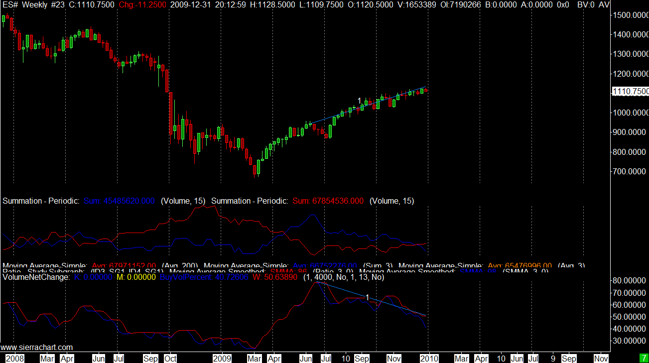
In my opinion, divergences between the raw price data and an other indicator are some of the best indications that turn around or a trend is about to change course. When analysing stock indices at the this time I see many divergences that are non-correlated, and it is this point that makes me feel a change in trend is imminent. The chart below contains my own proprietary longterm volume based indicator. I am finding this to be a very reliable "guide" in my trading decisions. Take a look on the chart at points 1, where I have marked the divergence between price and indicator. This is on the weekly chart, which means the divergence should be rather well matured by now. What I like about this divergence between price and indicator is that the indicator is not based on price, but based on volume. Volume is the master, the head chef in the kitchen so to speak when it comes to market direction and turning points. Looking at the chart, there can be no argument that buyers as a percentage of total market activity have waned and waned over the last few months. This is classic topping out behaviour, or at least it is something to be acutely aware of that a top is very close.
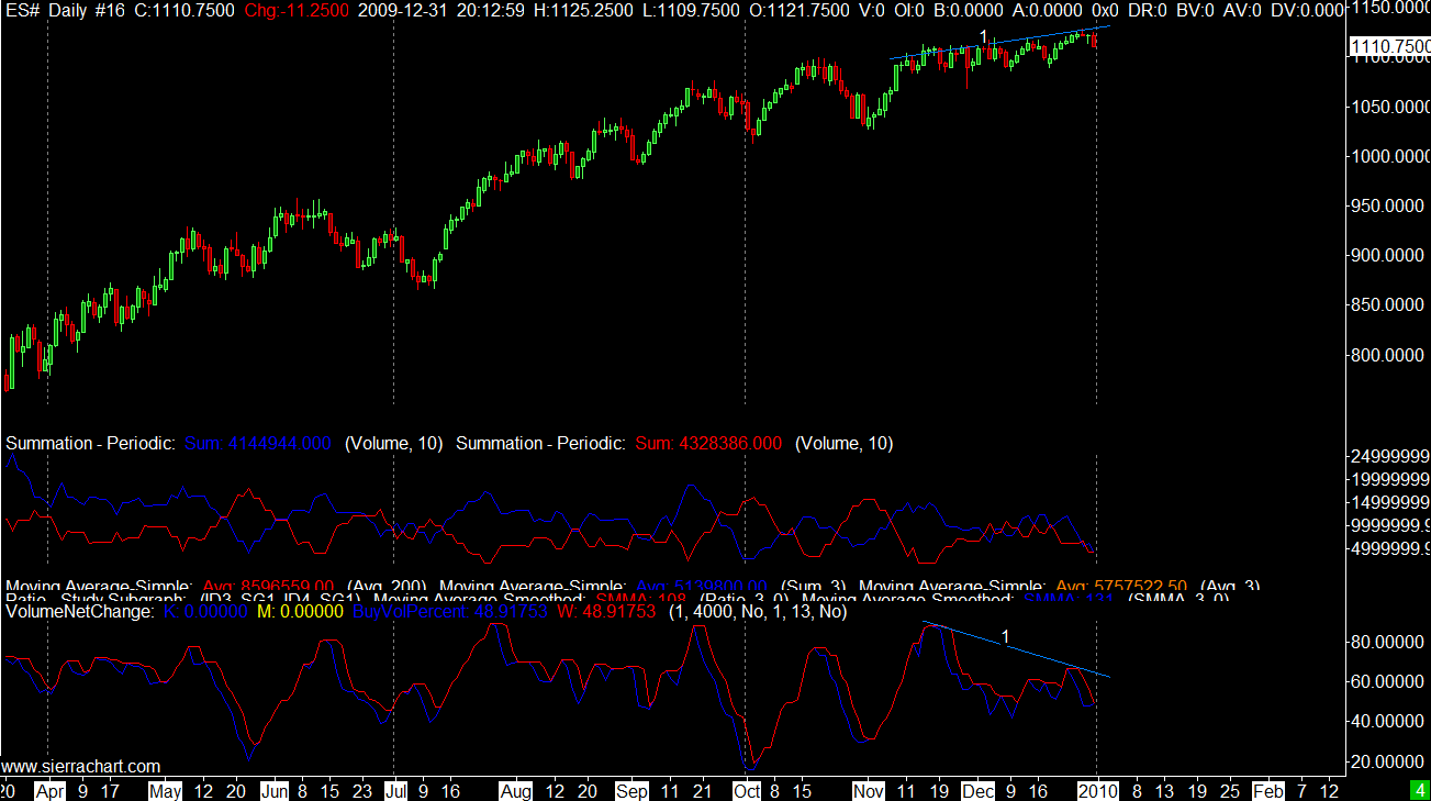
I ll also pull up a chart of the daily S&P 500 futures. The same story is being read aloud on this chart. This volume indicator is of a more short term nature, and it is nice to see it confirming the weekly signal. Buyers are waning and price has crawled ever so slowly higher despite this fact, but thats not what strong sustainable rallys are made from, so it is likely a turn is near.
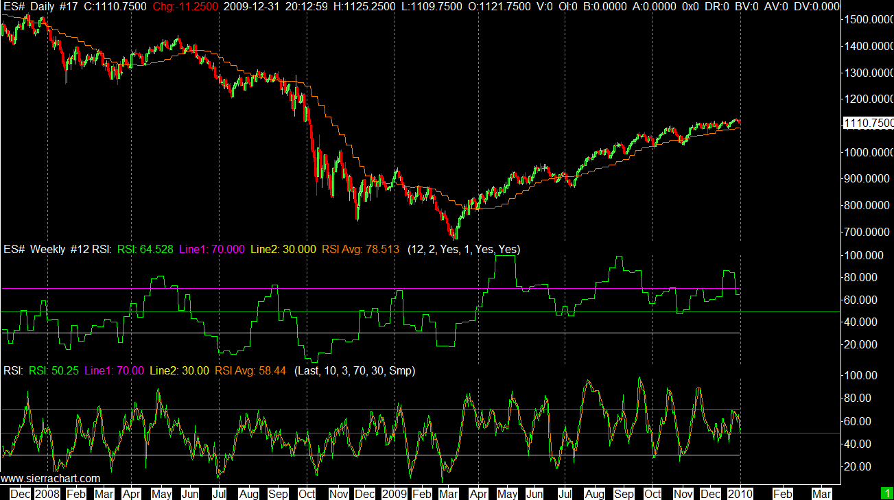
Next we have divergences showing up in indicators based on price alone, this is non-correlated to the first divergence we have just looked at, as it is based on volume. As I said earlier as many non-correlated signals all strumming the same song as possible will increase our chances of being right.
This is the daily S&P 500 FUT with two RSI indicators over-layed. The first RSI below the price is referencing the weekly price chart and the second is based on the daily. It is interesting to note that what we have is two divergences on the both weekly and daily RSI.
Market Internals Also Showing Divergence
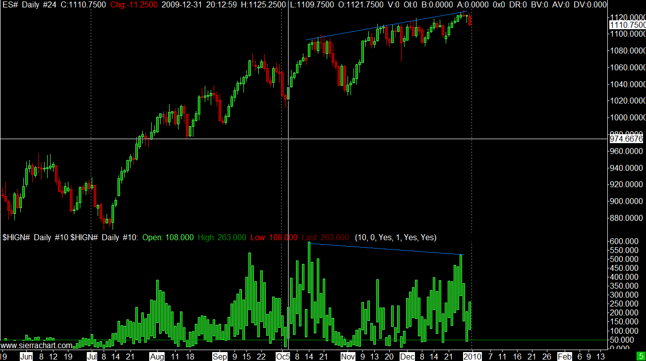
Market internals are an area I don't think enough attention is given to by market technicians. I believe that looking behind the price into the actual market structure can give some telling signs about what is actually happening, how much force is behind a move, or when a move might be running out of steam. The chart below is again the daily ES and the market internal indicator shows the number of stocks daily that make new 52 week highs. At the start of this rally in March we can see that each new high was marked by a higher number of new stocks making new 52 week highs also. The monthly high on the 20th October was also marked with a new high in the stocks making new 52 week highs on the NYSE. However, in each subsequent high since that October high the number of stocks making new highs is also weakening.
No comments:
Post a Comment